NYPL Linkup
October - December 2023
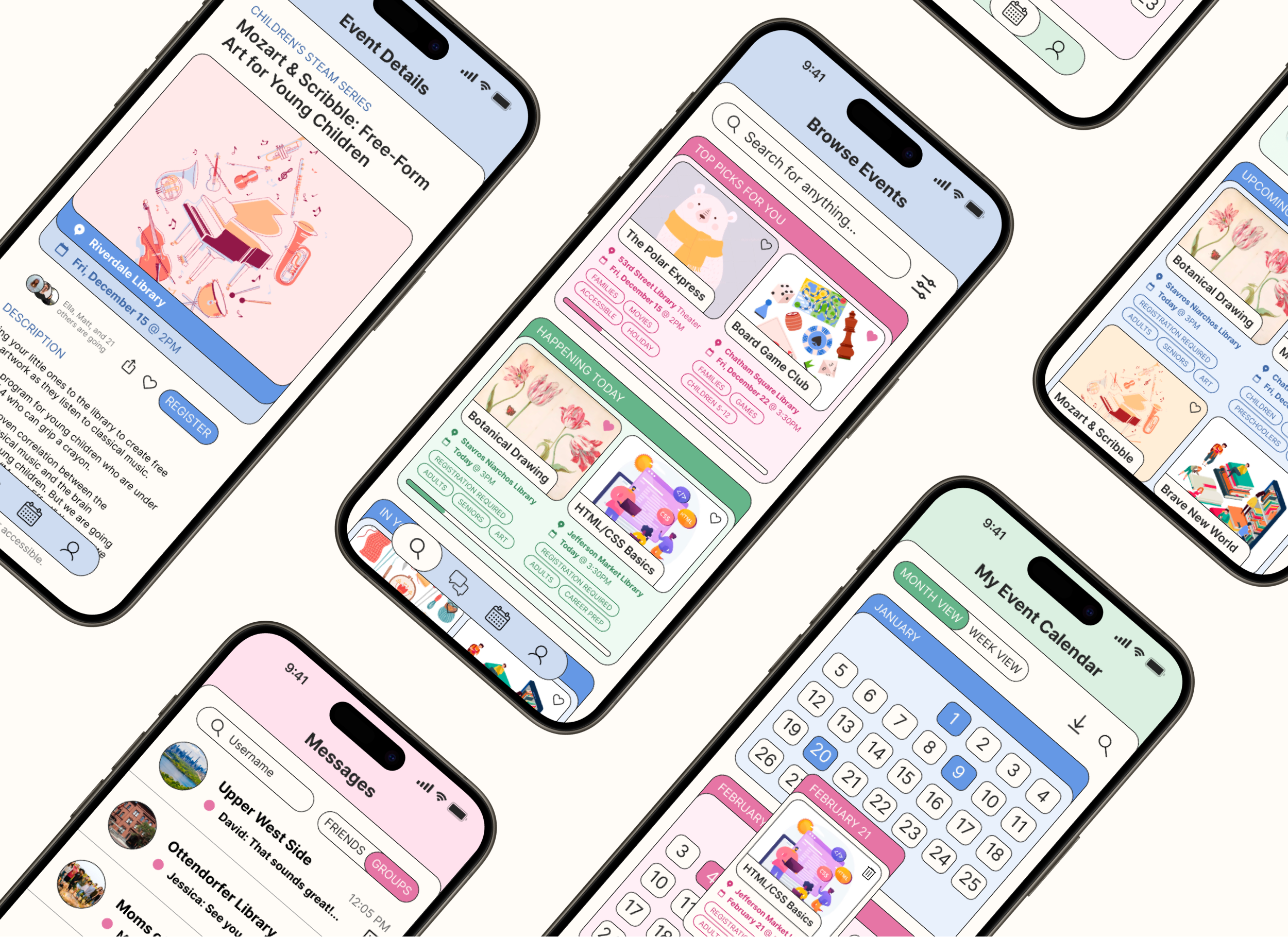
An app imagined for the New York Public Library (NYPL) system to help library patrons keep track of events and stay connected with their communities.
Team: Kelly Mao, Sasha Slavashevich, John Wang
Role: Product Designer
Technologies: Figma
Overview
As part of a UX design class, my group was tasked to research a problem with the library experience and come up with a solution. We centered in on the idea of creating community within libraries through spotlighting the events they offered. Our final product was a clickable prototype of an app that helps people keep track of events and stay in touch with other patrons.
Problem
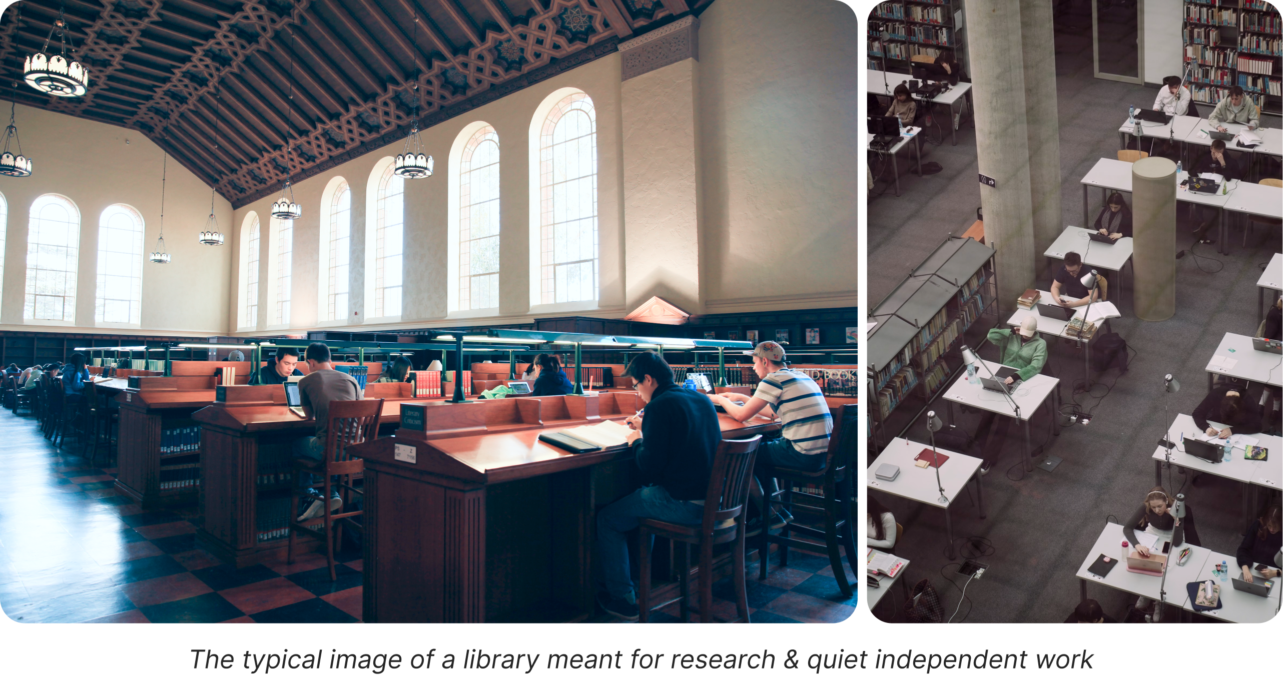
Many people think of the library as a place to sit by themselves for hours, deep in research or homework, in complete silence only broken by the occasional typing of keys or turning of a page. This creates an overall depressing, sterile, and lonely atmosphere and deters people from going if this is their sole experience of what a library is.
Libraries, at their core, are more than just study spaces or resources for checking out books. When we talked to the children’s librarian at Ottendorfer Library in the East Village, she emphasized the idea of library as community center:
“A library is really one of the only spaces in a community open to anyone, free of charge, where people of all ages and demographics can congregate and benefit from the shared resources.”
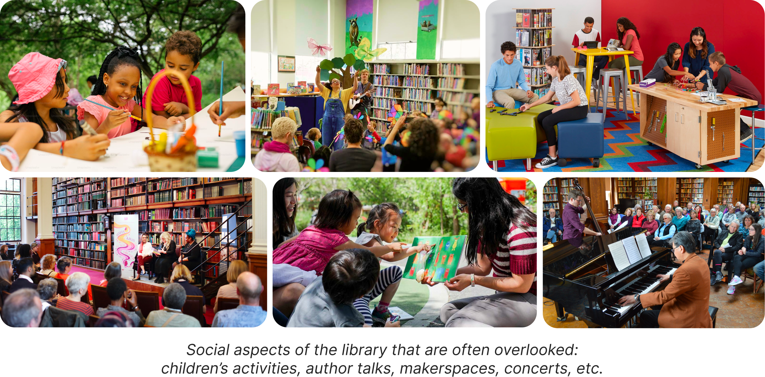
This idea of a social library experience really captivated us, as we felt that it had been overlooked in our preliminary interviews and other libraries we had visited. My team wanted to focus on ways we could introduce more community engagement within libraries, and open up opportunities for socialization and conversation.
Research
User Research
As part of research, we visited libraries in the New York Public Library (NYPL) system and cold-interviewed people we found there. Talking to the children’s librarian inspired us to focus on interviewing parents who brought their children to the library, as we felt that they would especially benefit from a more community- oriented library experience. In total, we interviewed 9 members of our target demographic (4 caregivers and 5 parents).
From interviewing people at the library, we found that a lot of parents and caregivers (babysitters, nannies, etc) agreed that the library should be a social environment — a place where kids can socialize on their own and develop interpersonal skills. Many of them took advantage of the free library events for that reason, which ranged from weekly storytime and playtime to special/seasonal events like outdoor concerts and film festivals. However, they still faced some difficulties when it came to staying up to date on events, planning ahead, and figuring out which new events to go to.
|
“I’ve never thought about taking my child to an event before.” |
“I mostly find events through word of mouth.” |
|
“Sometimes it’s hard to keep track of which events are on which days.” |
“Physical event flyers and calendars aren’t as helpful for non-English speakers.” |
|
“Often I’ll get an email about an event and by that point it's too late to sign up.” |
“I forget to go on the library calendar website unless I’m looking for something specific.” |
We also interviewed parents who did not use the library for social purposes at all, and found that a lot of them simply lacked awareness of these free activities but would be interested in participating if it were easier to find out about them. Currently, they are only advertised through physical flyers in the library and a hard-to-use event search page on the NYPL website.
User Persona
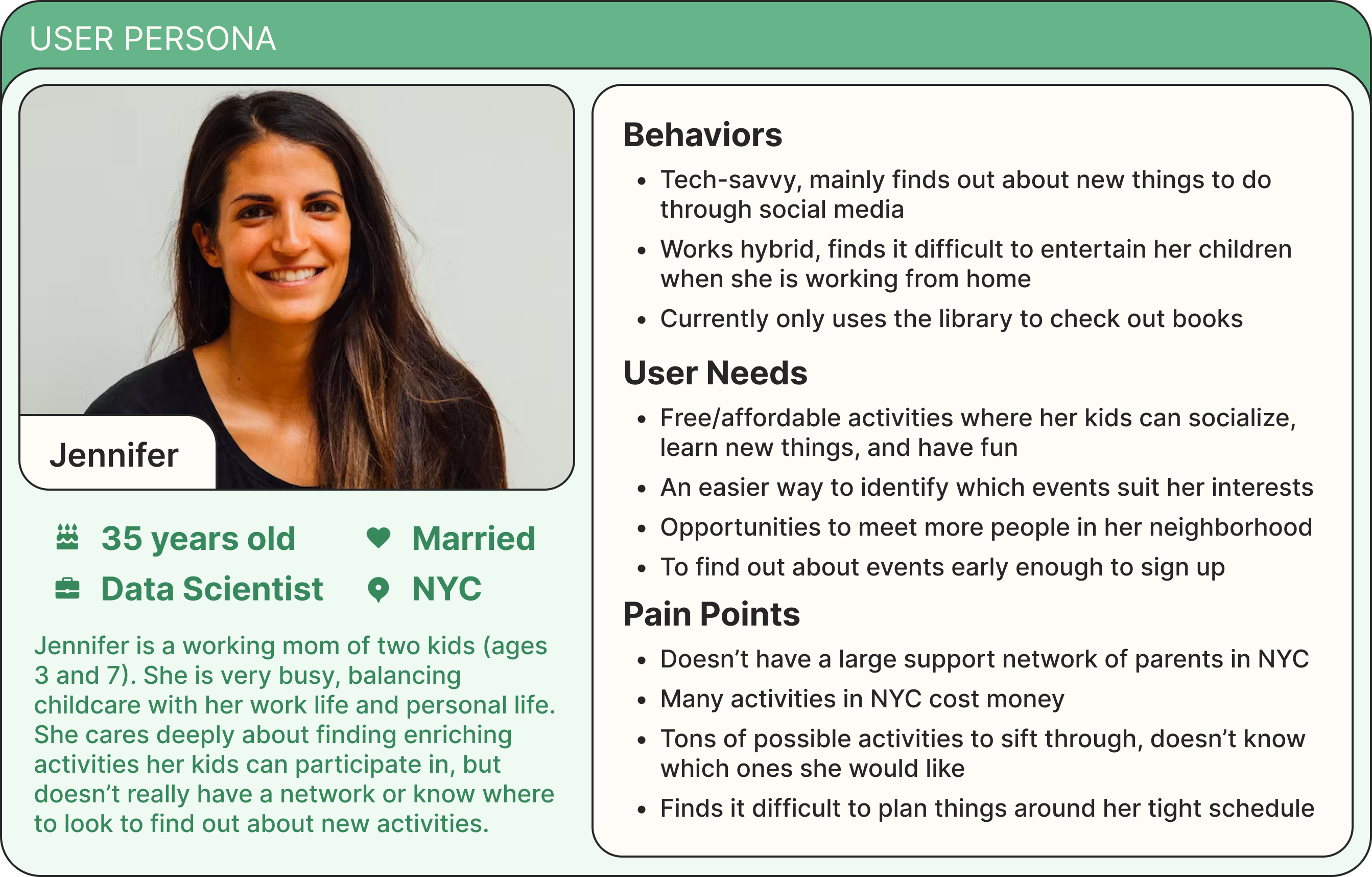
We created a user persona based on the parents we interviewed, to summarize their needs and pain points and guide our thinking in the design phase.
Our findings naturally pushed us to ask:
"How might we help parents and their kids better connect with their communities through library events?"
Current NYPL Event Calendar
Before we could design an improvement, we had to research the current event search interface on the NYPL website.
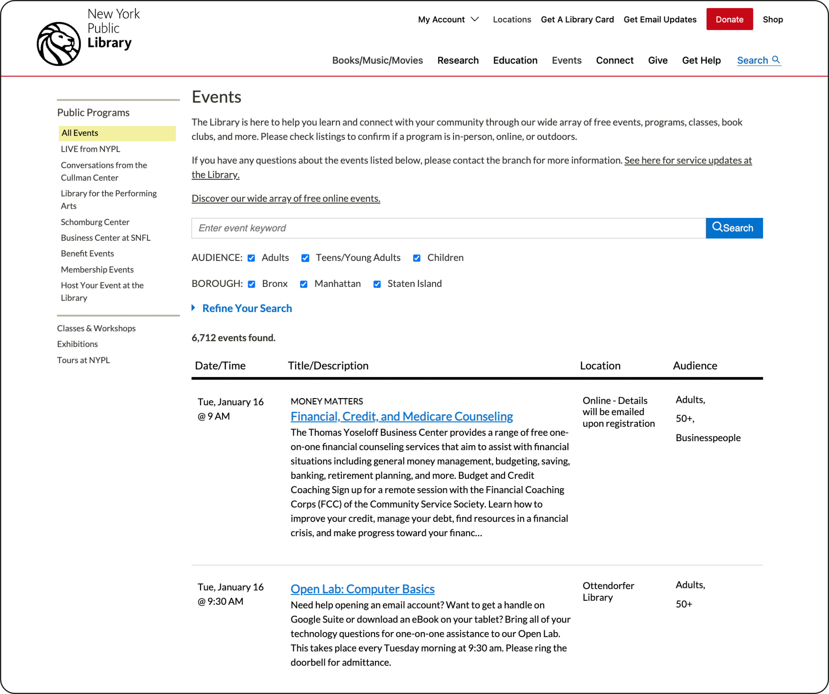
The main problems we found with the current system are:
- Not conducive to browsing (just a long list of events to scroll through)
- Text-heavy, with little emphasis on important event details
- Requires user to adjust many filters each time they open the event calendar
- Hard to use for people who aren’t already familiar with library offerings
Rather than redesigning this, we wanted to design a completely new way for parents (and New Yorkers in general) to engage with their communities through their local libraries. We aimed to incorporate three aspects:
- Personalization: Find events targeted to suit your demographics and interests.
- Socialization: Interact with other members of the community to go to events together, or just keep in touch.
- Organization: Make it easier to plan events around a busy schedule.
Competitive Analysis
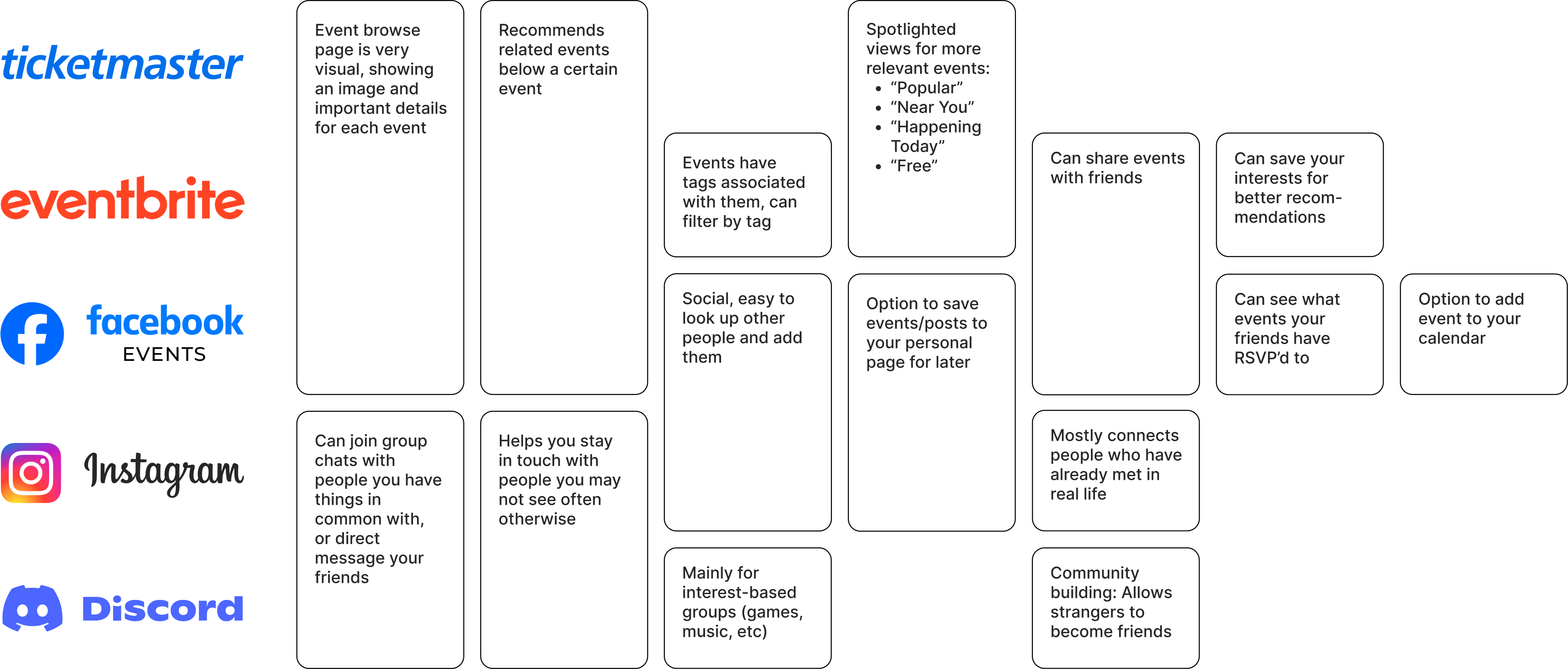
To see how other platforms addressed these goals, we analyzed event apps (Ticketmaster, Eventbrite, Facebook Events) as well as social apps (Instagram, Discord).
Design Phase
Brainstorming
We went wide with our brainstorming, generating as many ideas as we could through post-it ideation exercises.

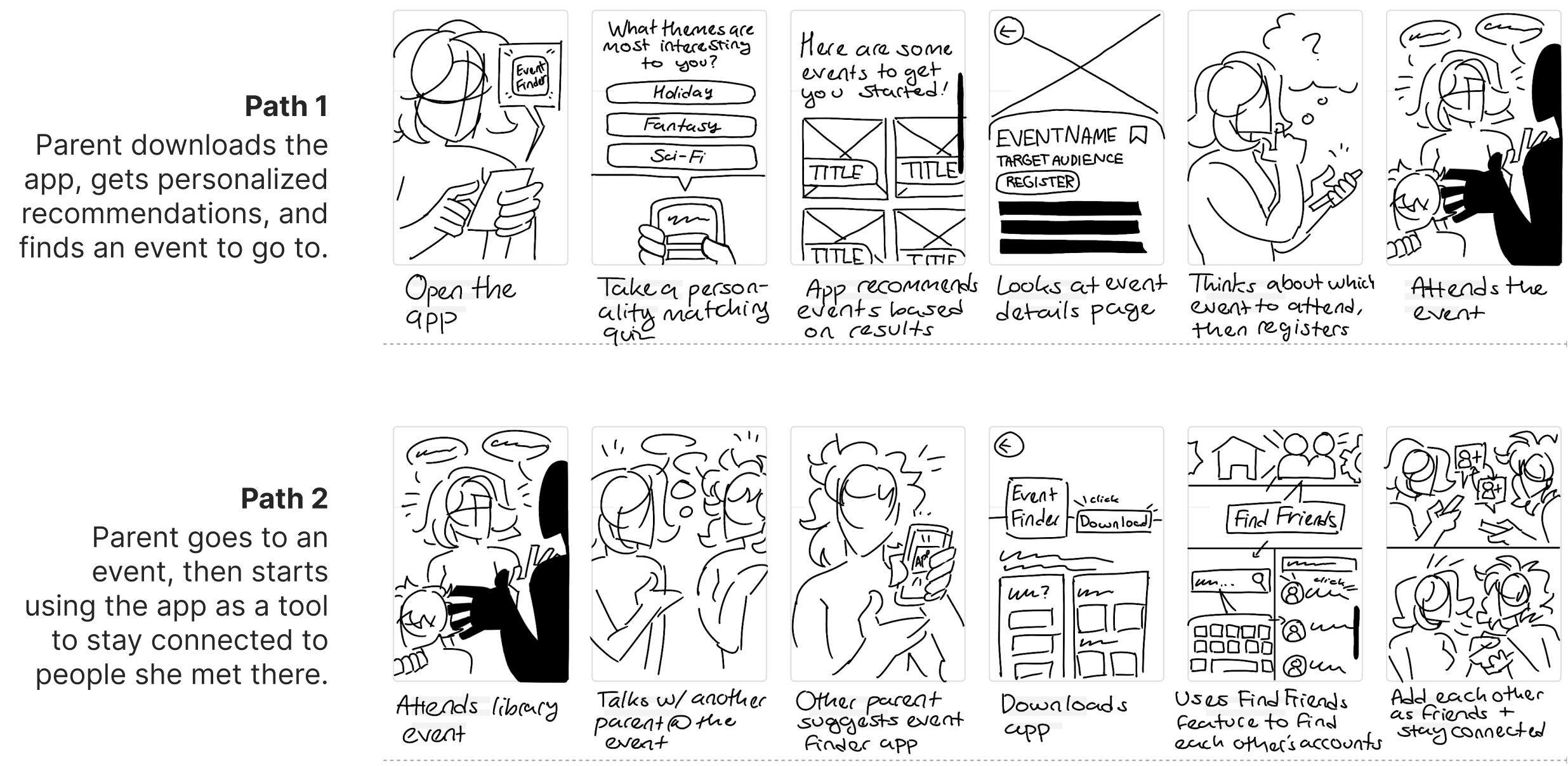
Storyboards
To further explore our initial ideas, we imagined what the user journey of a parent using our app might look like.
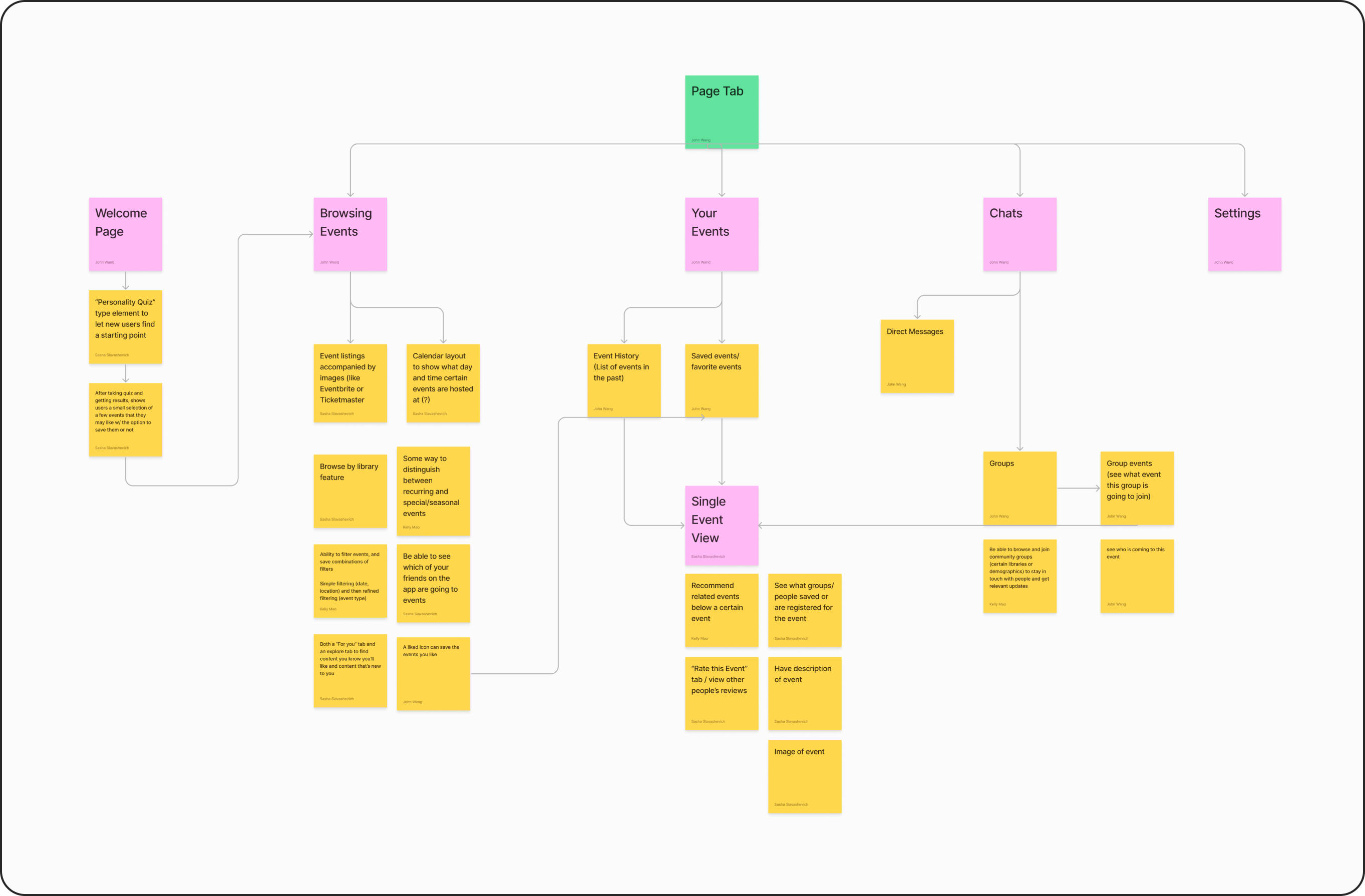
User Flow Diagram
After getting positive feedback on the storyboard from parents we interviewed, we continued by mapping out specific features and pages we wanted in the app.
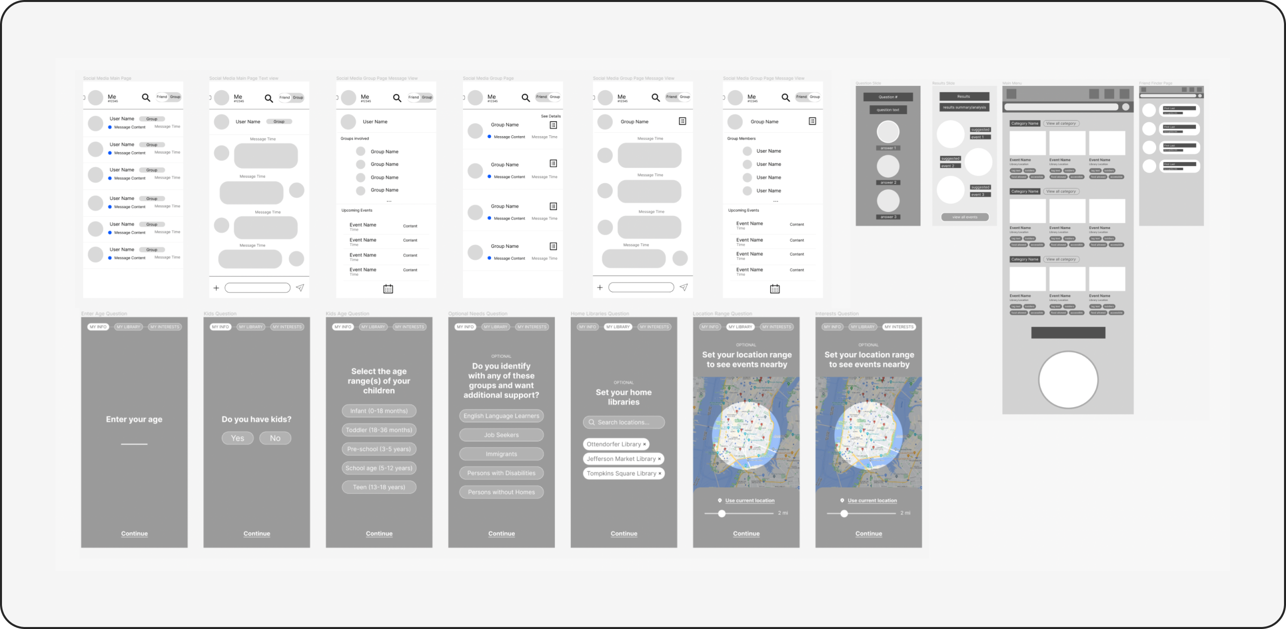
Low Fidelity Wireframes
We laid out what each page in the user flow might look like through creating simple wireframes in Figma.
Critique & Changes
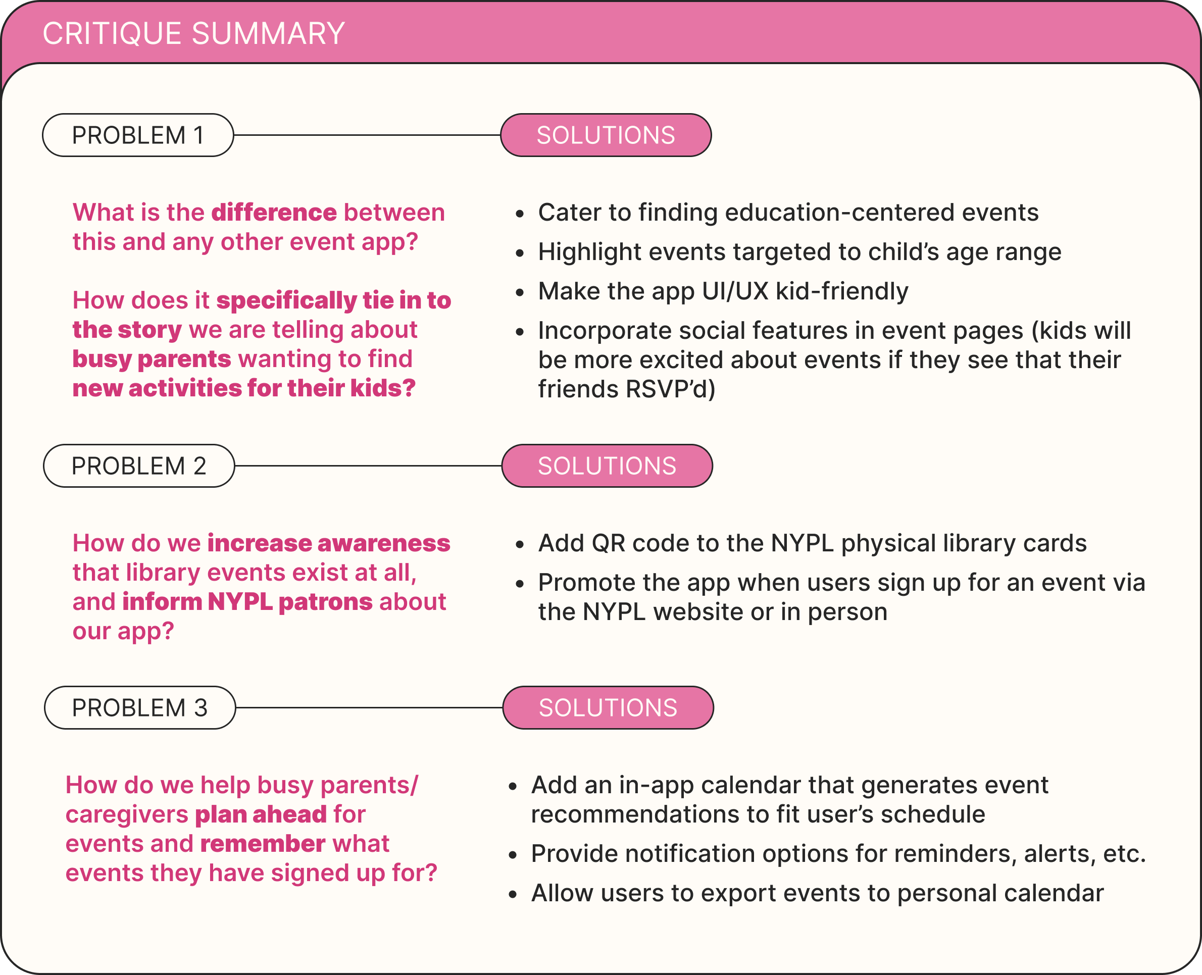
At this stage, we presented our app concept and wireframing progress to four UX designers invited to critique. Talking to the designers helped draw our attention to a few key gaps in our designs so far.
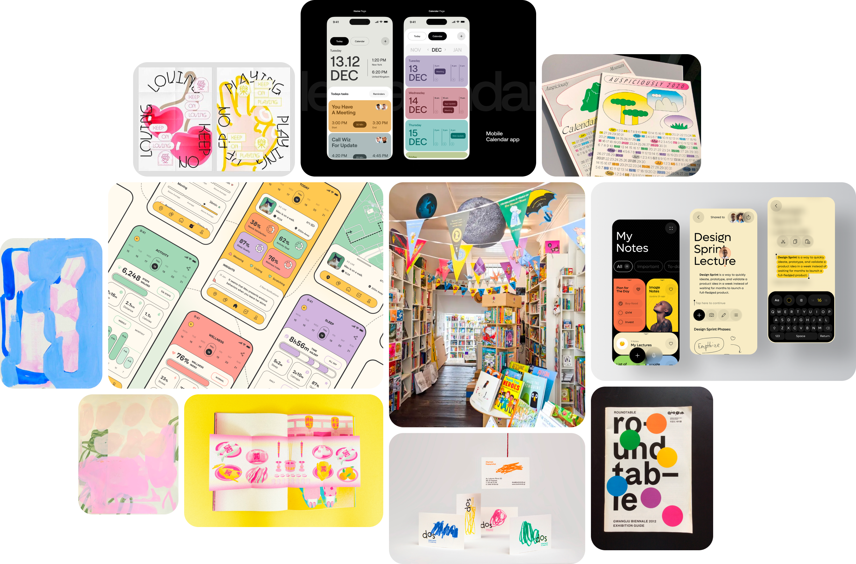
Moodboard & Identity
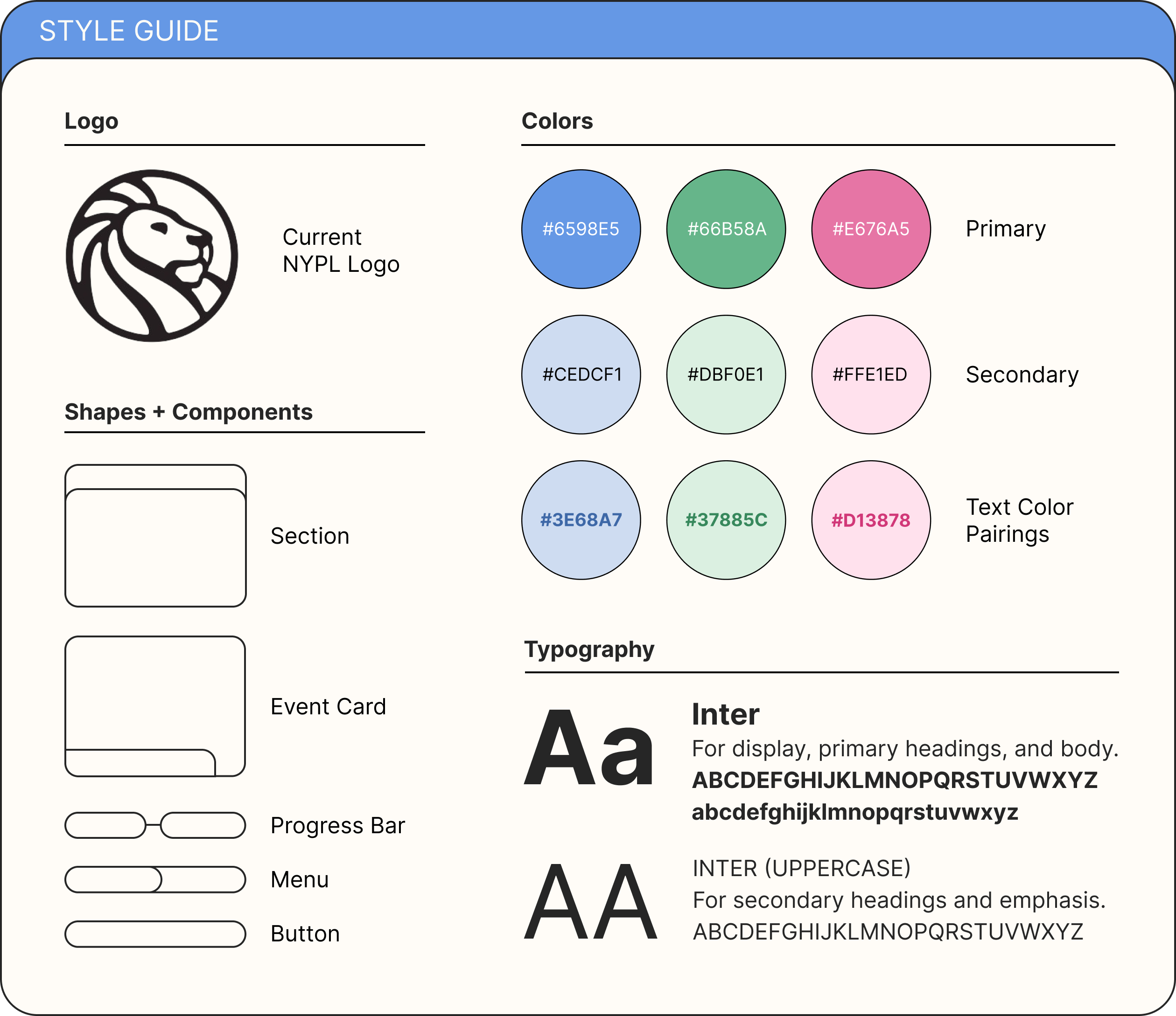
To make sure we had a unified view of the app's look and feel before fleshing out the designs, my group collected images that inspired us. We embraced bright pastel colors and friendly rounded bubble shapes, to make the app as kid-friendly as possible.
The goal was to design a user experience that would be fun for the parent and child to do together, so that finding activities became less of a chore for the parent and more of a chance to explore and get excited about new events.
Final Design
I took on most of the work in transitioning from low-fidelity wireframes to the final prototype, and making sure the visual language of the app was consistent between all screens.
Our final product is organized into four components, broken down below.
Personalization
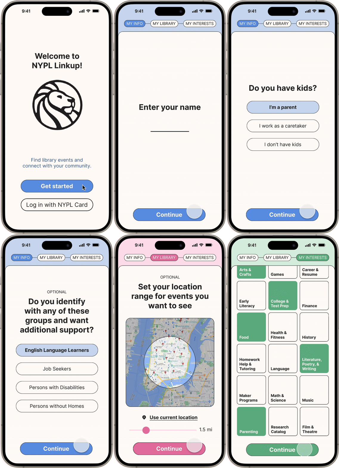
When you first log in, you can help the app get to know you better by inputting your event preferences and interests in a short quiz.

Event Discovery
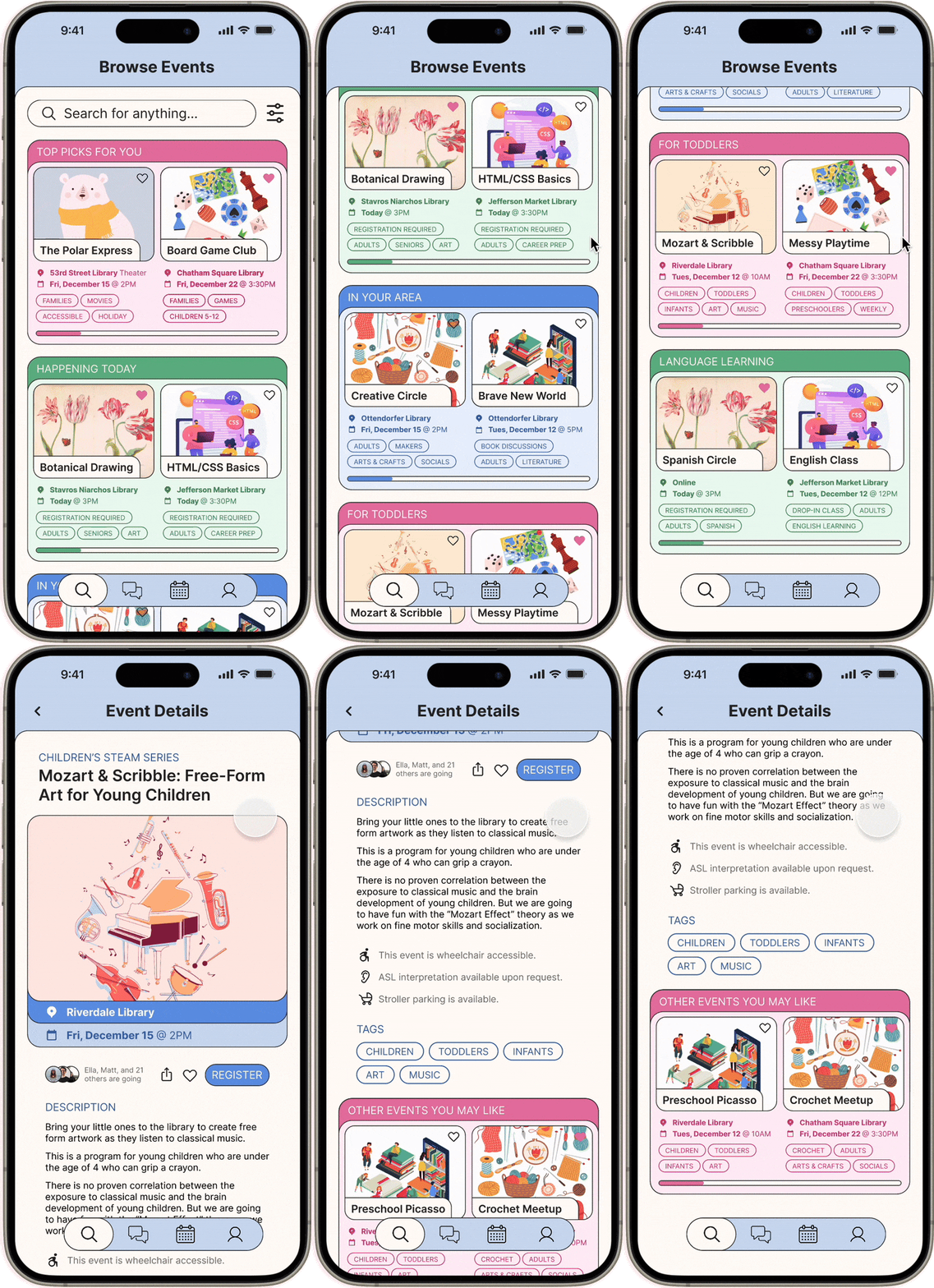
In the browse page, you can view event highlights in the categories most relevant to you. You can also further refine the search or favorite events for later.
In an individual event page, you can view the event description, accessibility notes, tags, registration button, and other related events. You can also share the event and see which of your friends are going.

Community Interaction
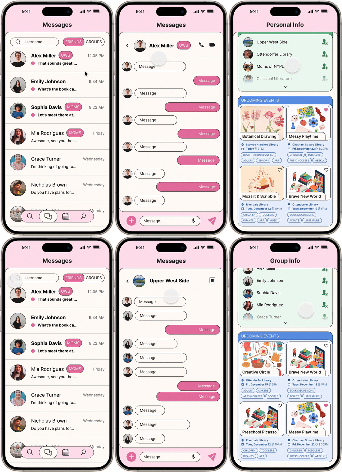
In the Friends tab, you can direct message your friends, see what groups they are in, and see what upcoming events they’re going to.
In the Groups tab, you can message groups you’ve joined to connect with people who share things in common with you, and see what upcoming events the group is planning to go to.

Organization and Scheduling
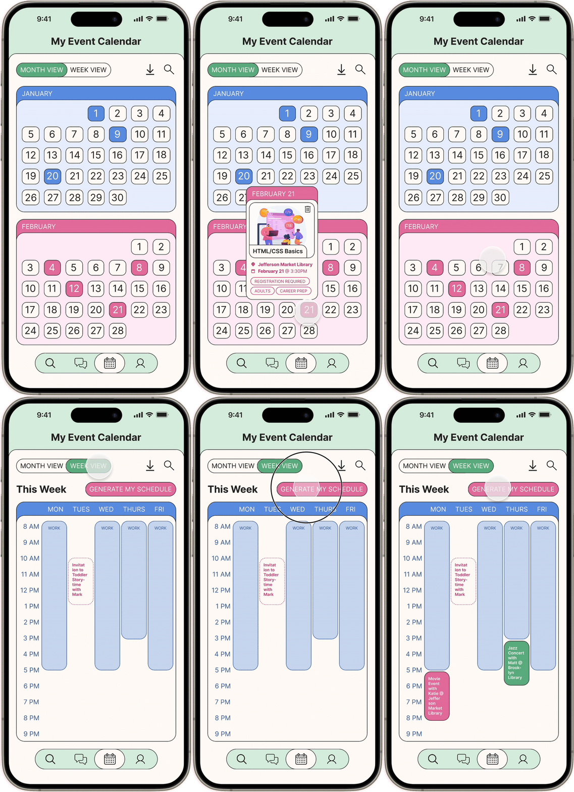
In the event calendar, there’s both a monthly view and weekly view. In the weekly view, you can input your availability and have the app generate event recommendations that fit your schedule. You can also view your existing event plans and accept invitations from friends.

Takeaways
- This was my first time working within a formal design thinking framework, so I got to see how each step helps designers create a more compelling and useful product. I got firsthand experience with the process of going wide with research and ideation and then narrowing in during prototyping, as well as using tools like immersive research, post-it/whiteboard exercises, and storyboarding to generate and explore ideas.
- I learned how to properly conduct user interviews. It was extremely important to my group that we fully understand the user’s story by asking open-ended questions and not just go into the interview trying to confirm our assumptions. I’m also proud of my efforts to go beyond my own network by cold-interviewing strangers I met in the library, since it led to more diverse and insightful perspectives.