Boarding Pass Redesign
September 2022
A personal project I worked on to redesign the Delta Airlines boarding pass, as part of my Design Fundamentals class taught by Professor Katherine Dillon.
Contribution: Information Design, Graphic Design
Technologies: Figma
Overview
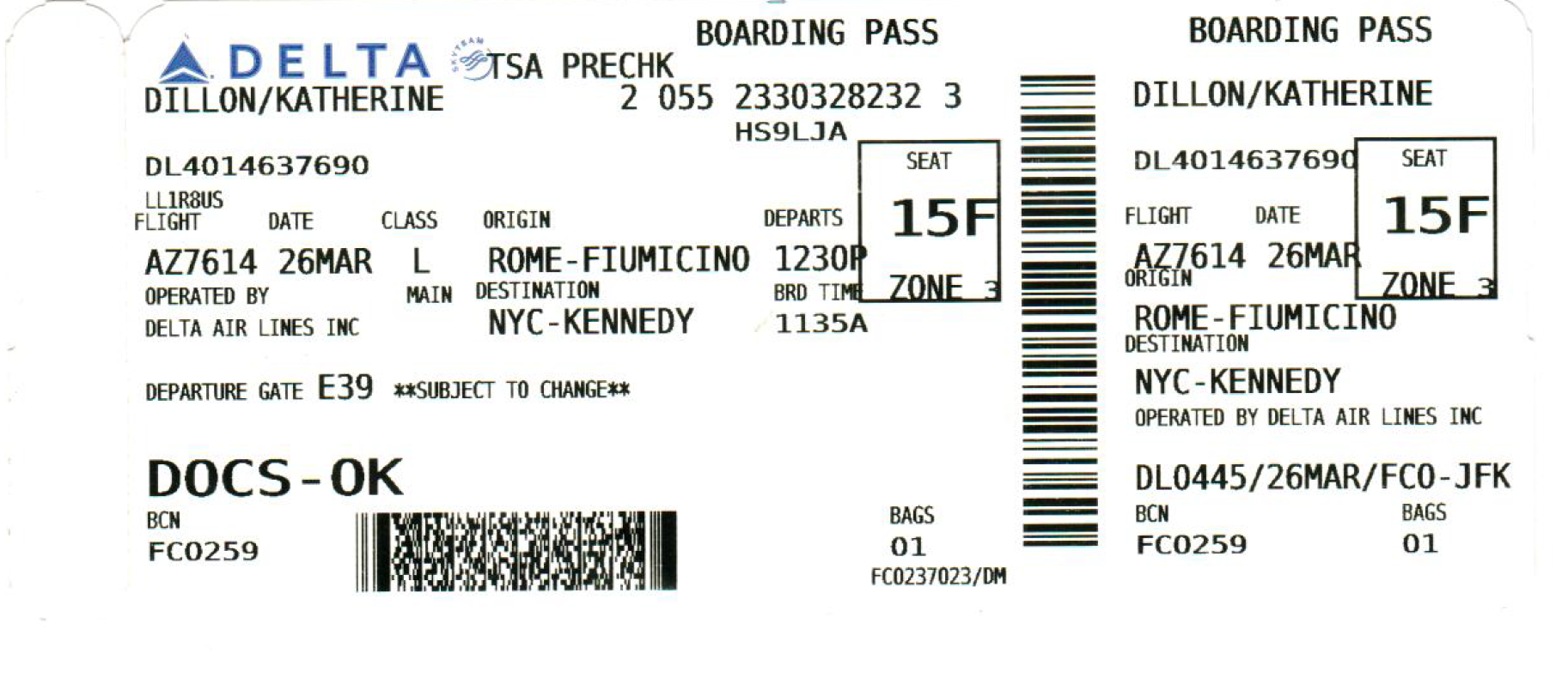
The entire air travel process is extremely stressful to begin with, and as a passenger, your boarding pass can either make or break that experience. Below is a real Delta boarding pass my professor received on a flight from Rome to NYC. With its lack of information hierarchy, cramped and overlapping text, and incomprehensible codes scattered throughout, it more closely resembles a word scramble than a helpful guide of flight information.
There are countless more examples of confusing boarding passes out there, showing that this is a huge user experience problem affecting anyone trying to navigate an airport. In this project, I decided to tackle the question of how to better design a boarding pass that would help passengers board their flights without getting lost or missing their boarding time, as well as make the jobs of airport workers easier and more efficient.
Original Delta Boarding Pass
Project Constraints
I first defined some constraints for the project to make sure my design would retain all the desired functionality and be practical to adopt.
First, I had to include all of the same information as the original boarding pass. This included textual information (flight details, passenger details, identification codes, etc) as well as graphical information (Delta logo, barcodes).
Assuming that an airline would have to print my design using their current system, I kept the same shape and size for the pass. I included color in my design since the original one had the logo in color, but I also designed a black-and-white version to accommodate potential cost restrictions.
Categorizing Information
I started out by categorizing the information by content type and sequence so that I could get a better sense of how to organize information on the boarding pass.
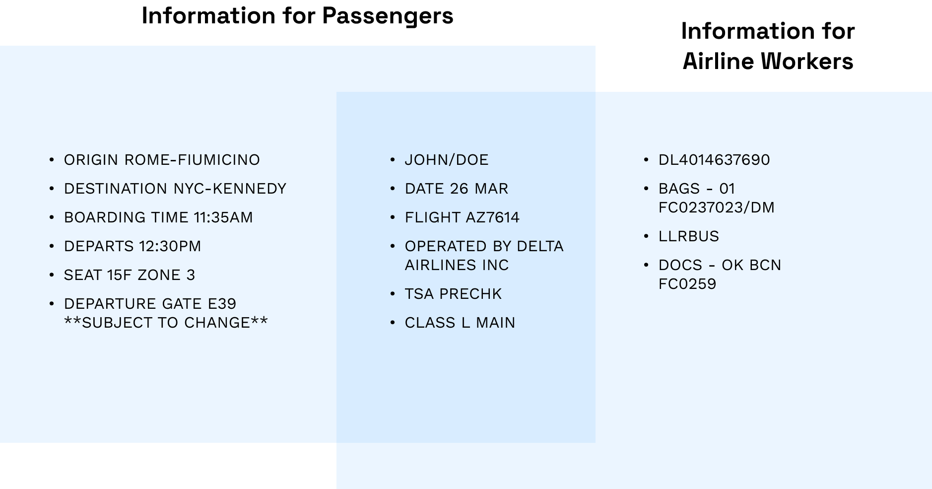
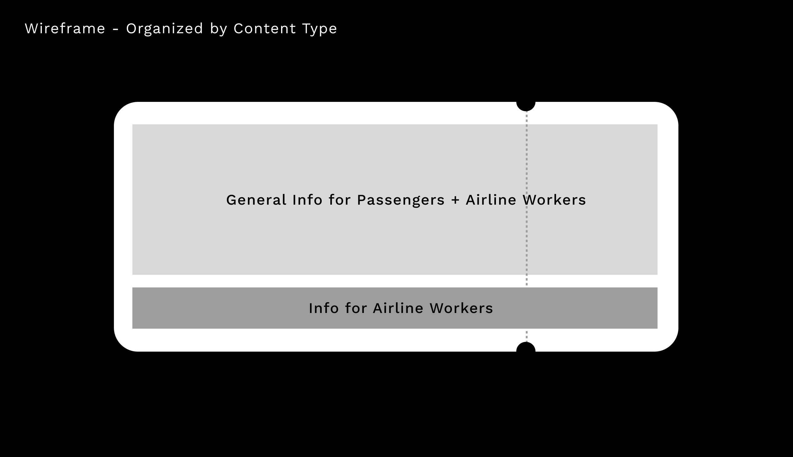
Recognizing that a boarding pass has two types of users — passengers and airport workers, I sorted the information by content type.
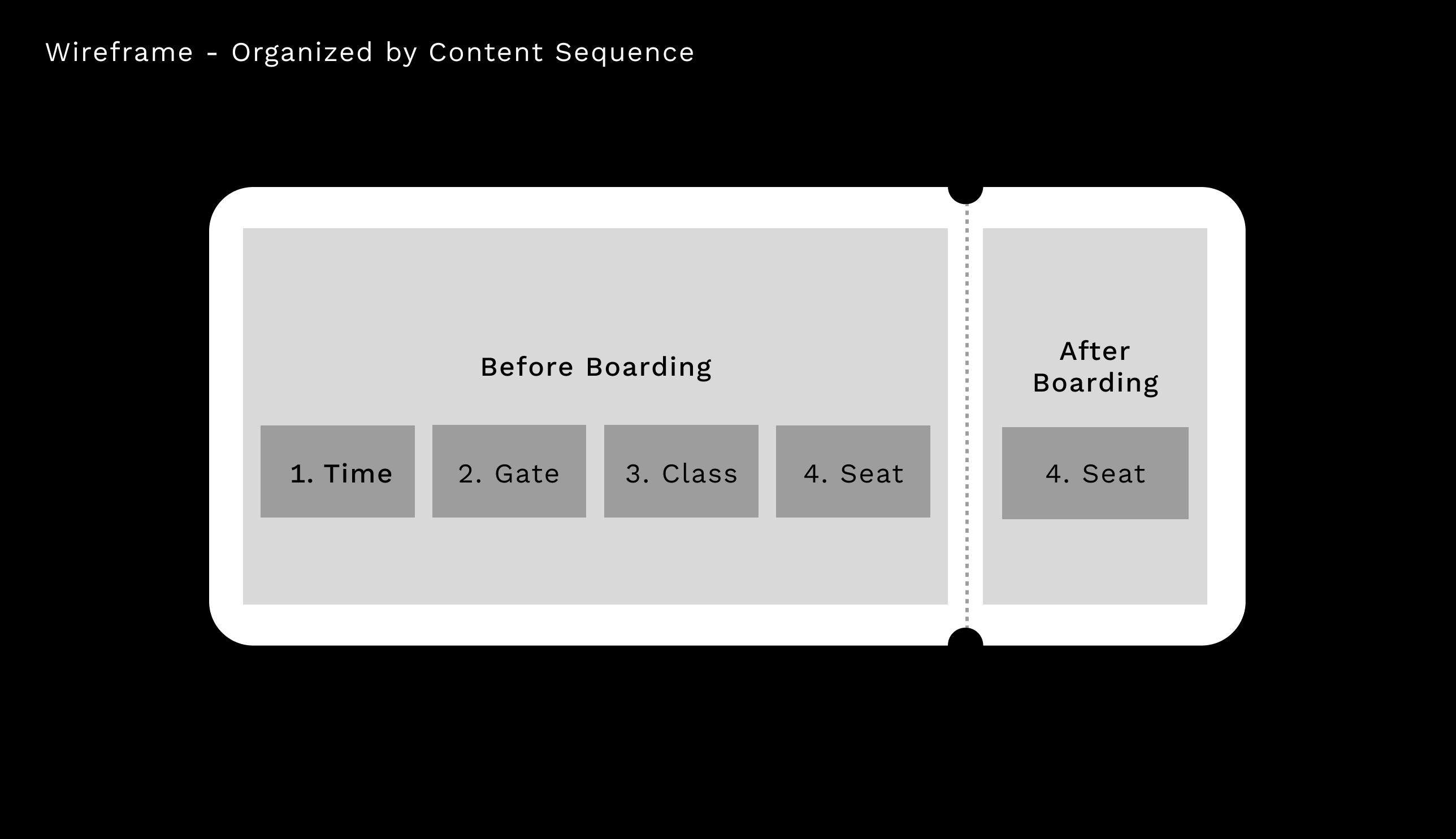
Next, I thought about how passengers would use the boarding pass throughout the entire stage between printing it out and boarding their flight. I wanted my design to present the information the user needs in the chronological order that they need it.
I identified the main information I wanted to highlight, and the order the passenger would need them in.

Then, I created two wireframes organized by content type and sequence.
Design Phase
Final Product
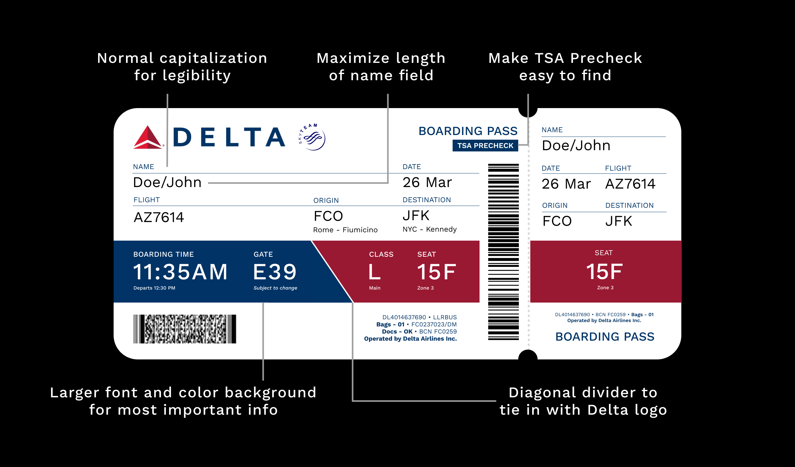
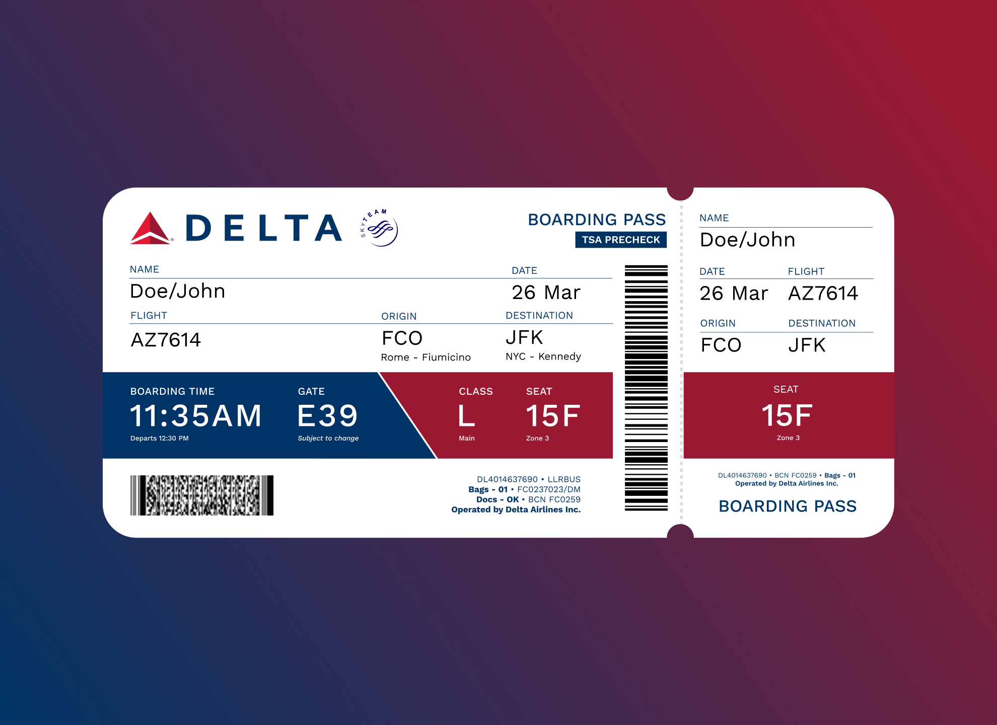
Here is my final boarding pass layout, designed in Figma.

Previous Iterations
For my first iteration, I was mainly focused on trying to lay out the information in a more organized way than the original pass. However, I didn't incorporate enough hierarchy, and as a result, it was difficult to skim and find the most important information.
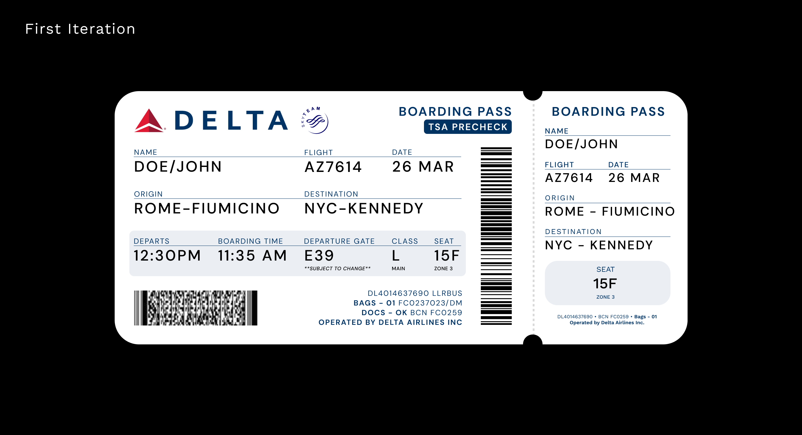
The main feedback I got from my first iteration was to include more negative space to make the individual elements more distinct, and use more color to create hierarchy.
To create more negative space, I decreased the font size of the less-important text like field labels and identification codes so the most important text would have room to breathe. I also changed the text from all-caps to title case and decreased the kerning to help with readability.
I decided to use the Delta logo's colors to highlight the information the passenger will most likely be looking for: departure time, gate, boarding class, and seat number. While the other information is important as well, the passenger will most likely already know things like flight origin and destination without needing to look them up. Below you can see the different layouts I tried for highlighting this boarding information (in order from right to left, top to bottom).
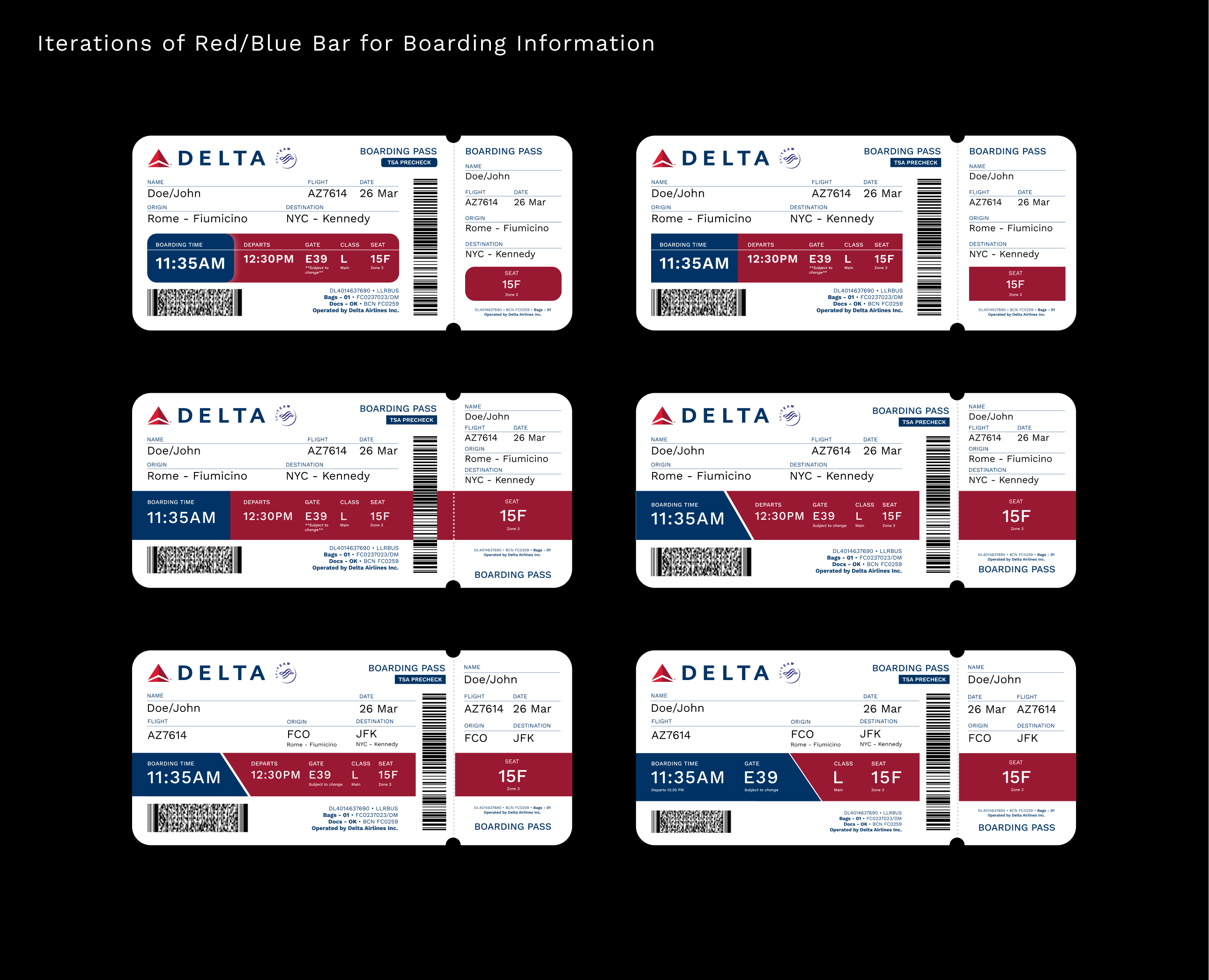
In the version I finally decided on (bottom right), the diagonal divider helps to further break up the information sequentially. Before the passenger finds their gate, they need to know their boarding time and gate number, which are both in blue. After they reach their gate, they need to know their boarding class and seat number, which are in red.
Here is a summary of these design decisions, as well as a few other considerations, that led me to my final product.
